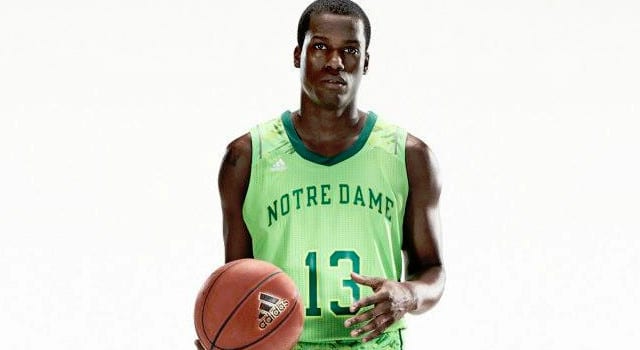

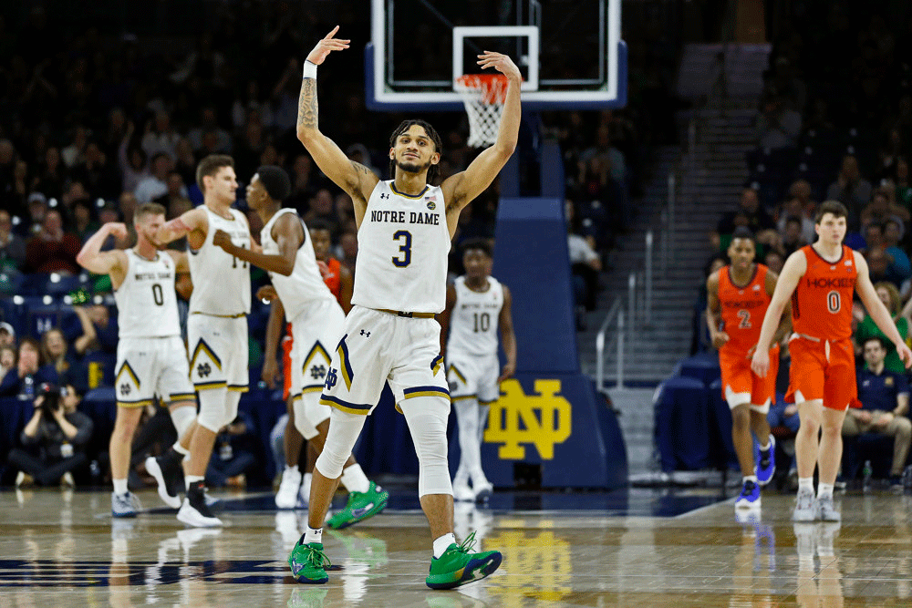
The Notre Dame basketball team will be wearing some new jerseys for the Big East and NCAA Tournaments that are ahem… interesting. Part McDonald’s Shamrock Shake, part basketball uniform, these new jerseys are sure to raise of the ire of Notre Dame fans who have freaked out over far less bold jerseys from the football team over the last few years.
Personally, I don’t mind them too much. The green socks might be a bit much, and the shorts are a bit over the top, but I can see the team and recruits loving them.
Here are a few reactions the jerseys have gotten on the UHND Twitter feed after we asked what people thought of them.
“whatever word we use that is worse than horrid.” @jeff_herr
“abomination.” @draholin
“These snot-colored unis are final? =” @alo83
“UGLY, with a capitial U. Does anyone have sense to say NO when it comes to things like this?” @50Murf
“Tradition be damned………..” @dabsab
Here is how the office press release described them when they were introduced yesterday.
Designed for a bold on-court look the adizero uniform system is made from 60 percent recycled materials and features FORMOTION technology for comfort and maximum mobility during shooting and dribbling. The uniforms feature adidas’ quick drying Revolution 30 technology found in current NBA uniforms and ClimaCool zones which move heat and moisture away from the body to keep the jersey light and dry during heavy sweating. The super-lightweight woven short is designed for improved breathability and a closer, more comfortable fit with compression base layers.
What are your thoughts on them?
is notre dame trying to recruit someone from san francisco?
Oh I get it…..very witty.
There’s something called Notre Dame pride, and whoever is responsible for letting these uniforms be worn should be ashamed. If I were a player on the team, I would protest. These have to be the ugliest uniforms worn in the NCAA! Just refrain from drinking too much when you look at these, as you might end up vomiting. What a waste of money!
Butt ugly. Take me back to the Princeton Tigers of the 60’s. Simple black uniforms with a number on the back.
What’s the difference what they wear – team is not going to see the second weekend of the tourney.
They look like a bottle of Mylanta. Hideous and in the same vein and Michigan’s head to toe bright yellow abomination they wore against MSU on Saturday.
And there are designers getting paid big $$ to come up with this crap.
Water the Mylanta in Atlanta is not a bad slogan.
Wear not water.
The uniform is ok! The question is will it become the official jersey for next season. The trend right now is the new jersey with a large logo, usually the first letter of the university on the front. A big ND with the number below would probably look good or just a large leprechaun and a number. It really doesn’t matter what jersey or uni they wear as long as they win! Go Irish!
Adidas is high – and so is ND for thinking these look good.
Somewhere in Galway a leprechaun’s boyfriend is missing his pjs.
Did someone say “Leprechaun”?
Nothing like a good basketball limerick to get things going:
“He was the center for the game versus UMASS…
And his balls had been replaced with fine brass…
So he had to shoot soft like a feather…
For if his balls clanged together…
Then sparks would fly out of his ass!”
can you sat adidas ad?
The Notre Dame athletic department today refused to confirm or deny rumors that it has asked adidas to design new uniforms for the football team too. One Notre Dame official, requesting anonymity, reportedly asked reporters: “What’s wrong with pink uniforms anyway? If the basketball team can wear lime green, why not pink for the football team?” Given an opportunity to clarify his answer, the official said he had just been speaking hypothetically.
We have learned from a confidential source in the school’s PR department that, in order to be responsive to environmental groups protesting the new basketball uniforms, any football uniforms designed by adidas for Notre Dame will be composed of 72% recycled material instead of the 60% used for the basketball uniforms.
Ugly, navy and gold with Irish on the front is fine with me.
The uniforms are cool, and the players and recruits like them. Fans are going to watch the games whatever they wear, and if they make Notre Dame more attractive to the players and recruits, it is a win. I am 48 and because I’m cheap, I bought a pair of orange and pink shorts on sale. I wore them jogging to my 14 yo boy’s soccer practice. 4 kids, who never speak to me, said something positive about the shorts. Kids like this stuff. It is good.
These are awful….. it is one thing to be bold…. it is another to make your jersey’s so ugly that you kind of are glad most people watching the TV won’t realize that this is ND.
Conservatism is cowardly. If I hear BK use the word “dynamic” one more time I’m going to punch my computer/TV. But you know what? DYNAMISM WINS. These uni’s are far from conservative. Give ’em a shot.
I guess if your goal is to distract your opponent with laughter to get easy layups.
All that matters is whether the people who are going to be wearing them (the players on the team) like them.
These unis are ugly and remind me of these: http://www.uni-watch.com/2011/12/23/the-story-behind-notre-dames-1991-lime-green-uniforms/
Joe – the one you just posted from 91 is way better than this one IMO