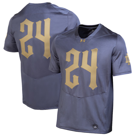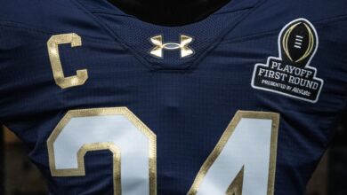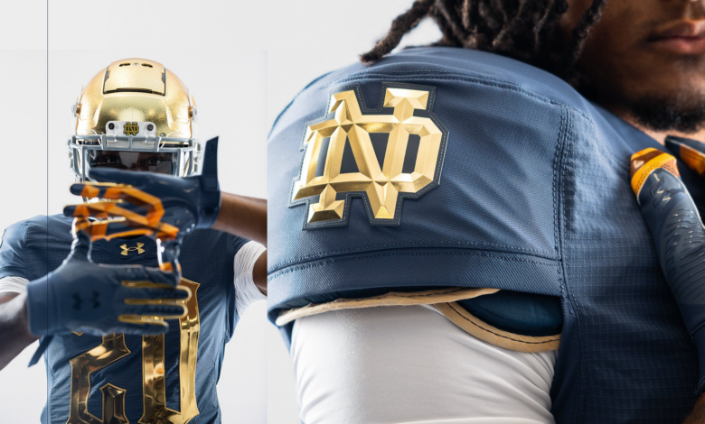
On Wednesday, Notre Dame released their alternate jerseys for the 2024 Shamrock Series game against Army in Yankee Stadium, and they were close to knocking it out of the park. Overall, they are fine but a few design choices might leave some fans in the stand having a hard time quickly picking up who has the ball on any given play.
Let me start by admitting that I am no longer the target audience for these jerseys. I’m a 40+ year-old dad who recently switched to New Balance (which is fantastic, mind you), so I am well aware that these jerseys are not meant to appeal to me. At the same time, I have a design arts degree, and despite my recent New Balance switch, I still like many of the old Shamrock Series jerseys. The “Green Monsters” from 2015, for instance? Those still slap. The white-on-white look from the Vegas game in 2022? Still love those. So, I don’t think I am totally out of touch.
Conceptually, I think these jerseys did a pretty good job of giving a modern look while honoring the past with the details, which is precisely what you want with the Shamrock Series jerseys. From an execution perspective, though, I think some elements just missed the mark.
Let’s start with what I think landed. Using a “blue-gray” color to honor the Four Horsemen in a game against Army in New York was brilliant. The shade of “blue-gray” that Under Armour used also really pops – as much as a gray tone can pop. They could have really fallen flat using a blue-gray color, but they nailed the color, so job well done there.
The beveled interlocking “ND” logo on the shoulder pads also totally pops out and looks fantastic. It’s a minor detail, but it stands out and looks great. Notre Dame and Under Armour did a great job making the ND on the standard jerseys pop with a metallic look this year as well.
My main issue with this year’s renditions almost entirely rests with the numerals. I don’t mind the shiny/metallic look by itself. In fact, I actually like it quite a bit on the new standard home jerseys that Notre Dame unveiled last week. My issue is the font used and the size. Under Armour used a gothic font because New York is “Gotham” city. That feels like a major stretch to me and a pretty big swing-and-miss, although perhaps that’s appropriate for a game that will be played in Yankee Stadium, given how the current Yankees seem to be swinging and missing quite a bit these days.
The combination of the font, size, and metallic nature will make it hard for anyone in the stands to make out what someone’s number is, which becomes a bit problematic when there aren’t names on the backs of the jerseys either. A simpler font selection or perhaps a less metallic look, and that might have been avoided. Granted, we’ve only seen these in a few promo pictures, so they may look great on the field when the Irish take on the Army in the fall.
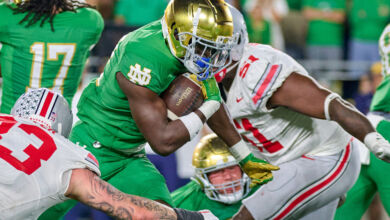
On a positive note, this year’s Shamrock Series jerseys are still much better than the ones the Irish wore last time they played in Yankee Stadium in 2018. Those jerseys looked too much like the Yankees and featured an alternative helmet that ranks among the worst alternate helmets the Irish have worn. As an overall ensemble, that uniform combination is probably my least favorite I’ve ever seen the Irish wear.
Again, I know I’m not the target audience for these jerseys. If they resonate with the players and recruits, then great. I’m all for it. Design-wise, these feel like they missed the mark a bit when they were close to hitting a home run. Which, again, feels fitting given the current state of the Yankees. (Go Phillies)

