This year’s version of The Shirt was unveiled Friday night. Here’s a look at this year’s version.
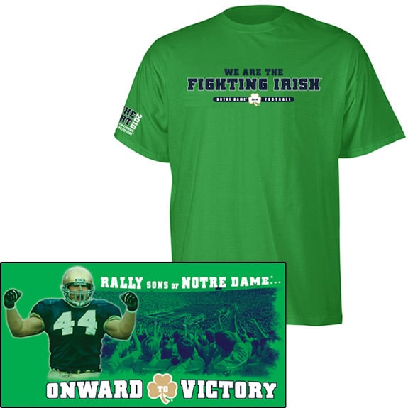
The front features a nice, simple layout with “We Are the Fighting Irish” while the back features an image of Jim Flannigan from the 1993 showdown with Florida State. The image was featured on the cover of Sports Illustrated the last time Notre Dame was ranked #1 in the country which is now almost 17 years ago.
The bright green color should show up well in the stadium – better than the dark green versions from 2006 and 2007
You can buy this year’s shirt from the Official Online ND Store.
Can anyone tell me if there is a site for the history of “The Shirt”. I have almost all of them dating back to the early nineties, but some of the early ones did not print the year on them. A little help? Thanks.
deep navy blue and gold,still the best jersey ever
and keep the names off
I’m holding out for the Blue and Gold one that says :
“2010 National Champions”
The shirt is much too busy — too many words: on front, on sleeves, big letters, small. Too many designs on front. Shamrock and block around some words just clutter the design. On the sleeve, words are written horizontally with numbers vertically and sideways! What a mishmash.
While the previous commenter is right that the color will be visible in the stadium, the issue is how will that color look? It is a sickly off-green. It is hard to imagine that anyone with even half a sense of color could find it aesthetically pleasing.
For design, the Ivies have always had a good sense of simplicity. They also use basic colors. If you don’t like those schools as models, fine. In any case, this shirt looks more like the shirt of a bumpkin high school.
Shut up and love it! GO IRISH
Love it! Simple but conveys the message that it is time to win a big game!
Go Irish!