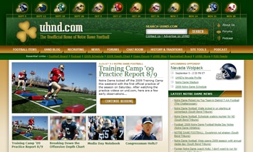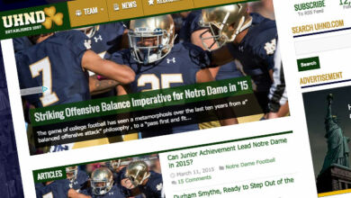
You probably have already noticed that things have changed quite a bit around here over the weekend. As we enter our 13th season covering Notre Dame football here at UHND.com, we have launched our latest redesign – our first major redesign since the beginning of the 2007 season. We are very proud of this design and will continue to make this site the best it can be.
Aside from the improved user interface, we have made several functionality improvements which should make finding information much easier.
Improvements
- Greater Accessibility of Content – A while back we noticed that we were posting blog entries much more frequently than we were posting featured articles. Because of this, the homepage ended up looking stale and out of date. To fix this, we combined our blog and features into one publishing tool and now these updates will be shown together on the homepage making it easier to find the most recent content on UHND.
- Enhanced Commenting – You can now comment on every article and post. You can also reply directly to someone’s else comment and can even choose to be notified via email if someone replies to a comment of yours.
- Improved Content – Across the top of the website you will find a graphical representation of the 2009 schedule which links to profiles of each team.
- Social Media Integration – You can now share posts and articles from UHND on all of the most popular social media websites such as Facebook, Twitter, Digg, Reddit, Delicious and more.
- Enhanced Search Capabilities – We have combined our backend systems which control all of the content outside of the forums so that when you search UHND, it will now search everything except the Forums.
Upcoming Improvements
- Improved Forum Layouts – Our next step in redesigning the site is getting the Forums to match the new look and feel of the rest of the site. The forums will be given the same headers and overall design improvements in the coming weeks.
- New Features – We have plenty of ideas for new features for UHND which we aren’t quite ready to introduce yet, but when we do we think everyone will really enjoy them.
We hope you like the new look here at UHND. Please feel free to let us know what you think of the redesign in the comments below.
Thanks,
The UHND.com Team


Frank, since I’m apparently fixated on the helmet header, I’ll offer up an example of what I had in mind. When researching some comments made by an obviously-concussed Joe Montana, I ran across a site that has helmets across the top and the home/away designation and isn’t too cluttered:
http://usctrojans.cstv.com/sports/m-footbl/usc-m-footbl-body.html#00
Frank – had an idea; you could modify the tags on the helmets in the header to reflect home or away. Not a very visual solution, but would be easy to do.
example – hover over Nevada helmet = “vs. Nevada”; hover over Michigan helmet = “@ Michigan”
Andy, that’s a good idea. We’ll make that change tonight.
I think the Irish are gonna’ “score” big-time against the “Wolpack”, how about you?
Edited.
Looks great, just wanted to say thanks for the hard work, and great job!
the helmet schedule at the top is a nice feature, but some designation of home/away would be helpful; and, this might be pushing it, maybe add game times/TV station too?
also, you might need to refine your news feed on the right hand side (which I like, btw). It sometimes picks up articles about high school teams named “Notre Dame.” not sure how to fix that.
Thanks for the comments Andy. we might be able to work in the location of the game into the helmets, but the game times and tv stations might end up making the header a bit too big.
I’ll take a look at the news feed we are using there tonight and see if we can get some better results.
Nice work, guys.